Dyslexia Style Guide 2020
Our Guide Covers:
- Dyslexia-Friendly fonts
- Headings and Sub-Headings
- Page Layouts
- Colour Schemes and Readability
- Writing Styles for Dyslexia
- Classroom Hints and Tips
- Dyslexia Awareness Week 2020

Dyslexia-Friendly Fonts
There are certain fonts that make text easier to read if you are dyslexic. The British Dyslexia Association (BDA) has identified sans serif fonts as ones to use in addition to Tahoma, Verdana, Calibri, Trebuchet and Century Gothic.
There is one font that’s been specifically designed for dyslexia. Lexie Readable is free to download for individual use. According to those who developed this font, Lexie Readable has features like the non-symmetrical b and d, and the handwritten forms of a and g may help dyslexic readers.
A standard 12-14 text font size is recommended although some dyslexic readers may request a larger size.
You should avoid the use of underlines and italics as this can make it more difficult to read as words may look crowded together.
Headings and Sub-Headings
It’s recommended that when you’re using headlines, you should use a font size that’s 20% larger than the main body text. To make the heading appear more prominent, use bold rather than an underline.
Microsoft Word has accessibility options under the Layout tab that will help you align headings correctly.
Importantly, for website content, you should always make sure that hyperlinks are differently styled than headings or the text used in the main body.

Page Layouts
- Left align text, without justification.
- Avoid multiple columns (as used in newspapers).
- Lines should not be too long: 60 to 70 characters.
- Use white space to remove clutter near text and group related content.
- Break up the text with regular section headings in long documents and include a table of contents.
Colour Schemes and Readability
By avoiding patterns on backgrounds, it can make it look less distracting for the reader. Single colour backgrounds will help text stand out along with good contrast levels between the background and the text itself.
It’s been reported that a white background can appear too dazzling and so a soft pastel colour or cream would be better.
Writing Styles for Dyslexia
Writing in short sentences will make the text easier for the reader to digest and you can also look to break up content with images. One instance where you can combine imagery and text is by using flow charts when you’re outlining procedures.
Bullet points are also beneficial in helping to split a large section of content, particularly if you’re listing information or giving instructions. Avoiding jargon will make the text flow more and it’s also worth using the expanded names rather than the abbreviations.

The graphic above is a simulation of a piece of code created by Swedish web developer Victor Widell to try and show how some passages of text can appear to those with dyslexia.
Classroom Hints and Tips
There are a number of ways to make text easier to read for students with dyslexia, according to Tes.
Here are some handy to help pupils…
– Seat pupils near to the front of the class and facing the board.
– Seat pupils near to a class teacher so that they can receive help easily if it’s needed.
– Avoid having a clash of left-handers and right-handers that can result in crowding and impact the ability to write.
– Have bookmarks, line trackers and overlays available.
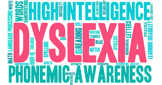
Dyslexia Awareness Week 2020
From October 5-11, the British Dyslexia Association is encouraging businesses and schools to set aside just 30 mins to look at ways to “empower dyslexia in the organisation, maximising the value it brings”.
This can be done in a variety of ways such as inviting those who are dyslexic to speak about their experiences or communicating what support there is currently available.
Further information on what activities you can carry out during Dyslexia Awareness Week can be found on the British Dyslexia Association website.