Colour Wheel Chart
- Introduction to the Colour Wheel Chart
- Colour Theory Overview
- Practical Use Cases
- Colour Codes for Design Software
- Colour Theory FAQs
Introduction to the Colour Wheel Chart
What is a Colour Wheel Chart?
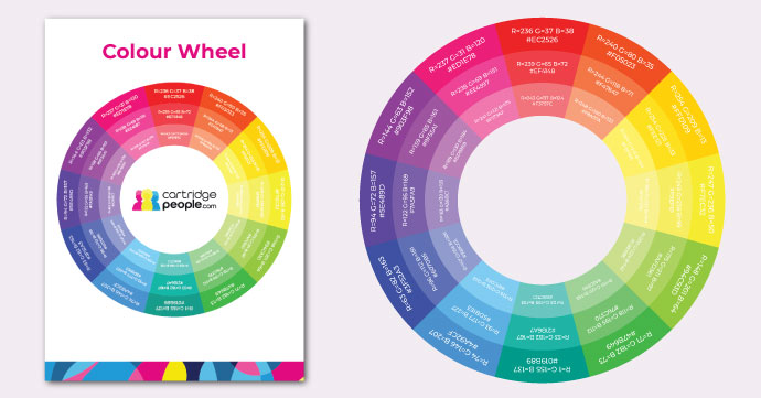
A colour wheel chart is a visual representation of the colour spectrum arranged according to chromatic relationship. Primary, secondary and tertiary colours are shown in a circle to illustrate the relationship between them.
Why Use a Colour Wheel Chart?
The colour wheel is a fundamental tool in design and art used to understand and apply colour theory principles. It helps artists and designers mix colours effectively, create colour harmony and enhance the emotional or visual impact of their work.
Ideal for graphic designers and digital artists, our colour wheel chart helps to identify complementary colours and visually pleasing colour combinations.
Once you’ve settled on your ideal colour scheme, we’ve made it easy to find the colours in your design software, as each shade on our colour chart also includes the corresponding RGB colour code and Hex colour code for reference. You can create a shade by adding black to a pure colour (hue), making the colour darker. Also, you could print out our colour wheel chart and keep it on your desk at work, for quick reference or inspiration at a glance, although due to the difference between RGB and CMYK, there may be slight variations when you print your page.
How to Use Our Colour Wheel Chart
This colour wheel chart is useful for various purposes including art projects, design work, educational teaching or simply as a reference to understand colour relationships better.
Using our colour wheel chart couldn’t be easier. Simply download the PDF and store it on your PC for easy reference.

Colour Theory Overview: What is Colour Theory?
Colour theory is the study of how colours interact and are organised on the colour wheel. This includes different colour relationships like complementary, analogous and triadic. Its purpose is to help create visually appealing and harmonious designs. An essential framework for designers and artists, they can use it to achieve balance and desired effects in creative projects, for example.
What are Primary, Secondary and Tertiary Colours?

Primary colours are the three hues that you cannot be create by mixing any other colours together; they are red, yellow and blue.
Secondary colours (green, orange and purple) are created by mixing two primary colours.
Tertiary colours result from mixing a primary colour with a neighbouring secondary colour, producing six shades like red-orange or blue-green.
What are Complementary Colours?

Complementary colours are directly opposite each other on the wheel of colours, such as red and green or blue and orange. When used together, they create a high contrast and vibrant look, but when mixed, they neutralise each other, resulting in a greyscale colour.
What are Split Complementary Colours and How Are They Different From Complementary Colours?

Split complementary colours involve using a base colour and the two colours adjacent to its complementary colour on the colour wheel. This scheme is easier to balance and less intense than using direct complements, offering more variety and subtlety in colour combinations, while maintaining contrast and vibrancy.
What are Analogous Colours and How are They Used in Design?

Analogous colours are groups of three colours that are next to each other on the colour wheel, (like blue, green and teal). These colours all share a common hue, with one being the dominant colour, which tends to be a primary colour, a secondary colour for support and a tertiary as an accent which adds a sense of balance and depth. In design, analogous colour schemes create serene and comfortable designs, as you can often find them in nature and are harmonious to the eye. As they blend so well together, they’re great for backgrounds, gradients and minimalistic designs.
What are Triadic Colours?

Three colours evenly spaced around the colour wheel, this combination of colours can be used to create a vibrant contrast (e.g., red, yellow and blue). It also maintains balance, ensuring designs are interesting visually but don’t overwhelm. Designers should adopt a triadic colour scheme for projects that require a bold and lively combination of colours, for instance. It can be effective when creating harmonious visuals that stand out, such as websites, branding and posters. Often, designers will choose one dominant colour, with the other two colours acting as contrasting accents.
What are Monochromatic Colours?

These are different shades, tints and tones of an individual hue. You can create a tint by adding white to a pure colour (hue), making the colour less intense. Tone refers to the adjustment of a colour’s intensity by adding grey (a mix of black and white) to the hue. This creates a more subdued, muted version of the original colour, without changing the overall hue. A monochromatic colour scheme varies the lightness and darkness of a base colour by adding white, black or grey. Subsequently, this creates a cohesive, harmonious and simple look.
Colour Psychology and Its Applications
Colours can greatly influence mood and perception. Consider the psychological effects of colours—warm colours often evoke feelings of happiness and energy, while cool colours can convey calmness and professionalism. Think about the context and audience of your design before you settle on a colour scheme. Then experiment with colour combinations using our colour wheel as a guide to achieve the desired mood of your design.
- Red = Energy, urgency or excitement, making it ideal for sales promotions or sports brands.
- Blue = Calm, trust, professionalism, blue is useful in healthcare and corporate settings.
- Yellow = Happiness, warmth and optimism are synonymous with yellow but overuse of the colour can signify caution.
- Green = Nature, balance and growth, making it great for wellness and eco-friendly branding.
- Purple = Luxury, creativity and mystery (e.g., for beauty and high-end brands).
- Black = Sophistication, elegance and authority for luxury fashion and corporate branding, for example.
- White = Conveying simplicity, purity and cleanliness, white supports a minimalist design, which is ideal for healthcare and wedding branding, for example. It can connote openness and space but can feel sterile if not balanced with other elements.
By incorporating colour psychology into your design choices, you can establish/maintain the message or feeling you want your design to evoke.
Practical Use Cases
This colour chart provides a helpful reminder of colour wheel theory and is great for both professional designers and those who are learning graphic design. This wheel includes three shades of the same colour, so you can select the intensity of colour you want. Our colour wheel chart is ideal for the following applications:
- Choosing colour schemes for graphic or web design.
- Finding complementary colours when looking for contrast/emphasis in design or artwork.
- Harmonising colours with analogous or monochromatic colour schemes.
- Balancing warm and cool colours for design aesthetics.
- Teaching colour theory to students.
- Matching colours with RGB/Hex codes for digital design projects.
- Quick reference tool for design inspiration.
Use Cases By Industry
Here are some practical examples of how different colour schemes can be used across a range of industries:
Graphic Design: Complementary colours create contrast in logos, making them more readable, establishing a brand identity. For example, blue and orange provides a vibrant contrast and is commonly used in tech and sports branding. Purple and yellow is also often used to create a striking, energetic look for creative and playful brands.
Web Design: Analogous colour schemes can create a calming, harmonious layout for your website. For example, use yellow, green and lime for your eco-friendly or lifestyle site. Also, you could use coral, peach and orange for a warm, welcoming analogous colour scheme that’s perfect for personal blogs or service-oriented sites.
Interior Design: Triadic colours can be used to add vibrancy to a living space. For example, red, yellow and blue is a bold, playful combination that is great for kids’ rooms or creative spaces. Purple, green and orange adds vibrancy and warmth, which would be suitable for living rooms or entertainment areas.
Fashion Design: Monochromatic colour schemes provide a sophisticated, cohesive look for clothing collections. For example, use various shades and tints of navy blue for a sleek, modern outfit or play with light and dark tones of soft beige for an elegant, neutral style. These schemes maintain harmony while adding depth through variation.
Colour Codes for Design Software
Included in our chart are RBG and Hex colour codes for quick and easy reference.
What are RGB and Hex Codes?
RGB (Red/Green/Blue): A colour model where colours are created by combining red, green and blue light. Each value ranges from 0-255, with each combination producing a different colour.
Hex Codes: A hexadecimal format that represents colours in digital design. A colour’s Hex code begins with a ‘#’ followed by 6 characters (numbers 0-9/letters A-F). This then corresponds to RGB values. For example, with #FF5733, ‘FF’ = red, ‘57’ = green and ‘33’ = blue.
Matching Colours to Digital Tools
Photoshop
- Open the colour picker by clicking the foreground colour.
- Enter the RGB or Hex code into the designated boxes.
Illustrator
- Double-click the fill or stroke box found in the toolbar.
- Enter the RGB values or Hex code in the colour picker window.
Canva
- Select the element you want to edit.
- Click on the colour tile and input the Hex code in the colour field.
Colour Accuracy Across Devices
Colours may vary between your screen and printout due to differences in device displays and printer colour calibration. Adjusting your printer settings for colour accuracy might help achieve a closer colour match. Here’s some tips for maintaining consistent colour accuracy across your devices:
Calibrate Monitors: Adjust your screen’s colour settings regularly, maintaining a standard profile.
Use Colour Profiles: Apply the same colour profile (such as sRGB or AdobeRGB) across your devices.
Test Print Samples: Print small sections before producing full prints to ensure colour accuracy.
Check Ambient Lighting: View the colours under consistent lighting to avoid misperception.
Embed Colour Profiles in Files: When you share your files, be sure to include embedded colour profiles to maintain accuracy across your devices.
Practical Uses for Colour Matching
Brand Consistency: Ensure colours are uniform in logos and marketing materials.
Product Design: Matching colours across different materials or iterations.
Web Design: Maintaining a cohesive online presence.
Print Media: Ensuring digital designs align with printed outputs.
Photography: Colour correction for accurate, natural tones in photos.
Colour Theory FAQs
To Sum Up
Here we’ve covered the basics of colour theory and by now you should have a comprehensive understanding of primary, secondary, tertiary and complementary colours. Use our colour wheel to create design harmony and contrast and identify matching colours via RGB/Hex codes, for accuracy across digital and print mediums. You’ll also be aware of how important colour psychology can be for your designs and evoking the desired emotions for your project. Follow the best practices outlined in this article to achieve and maintain colour consistency across screens and printouts.
Need advice on printing terminology? Why not check out our Printing Glossary?